Showing posts with label Underpaintings. Show all posts

Thursday, January 15, 2026

Jan, 2026 Virtual Hike - New York City & Analogous Colors

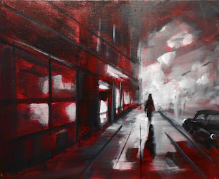
The Virtual Hike's destination for January 2026 was New York City. I searched  Google Street Views and found this interesting photo of somewhere in Brooklyn.

Here is my Google Street View photo and my initial underpainting
in black & white acrylic on a red toned canvas.


The finished painting.
Autumn in New York, 6x8 oil on canvas panel
 

As you can see, I seriously edited the orginal source photo. I'm also working with a very limited palette - 5 tubes of paint. My colors were - Burnt Sienna, Yellow Ochre, Lt Red, UM Blue and White. Then at the very end I added a few spots of bright turquoise as a relief color. 

This is called an analogous color scheme. (A color, its two neighboring colors and its complement, plus white, with a bit of a discord color added as a relief.)

There are many color combinations available in an analogous color scheme and I enjoyed the discipline. I plan to explore it further.

This painting is available in my eBay Store. And, as always, you can purchase this painting, or any of my paintings, directly from me if you prefer. Just email me at - mail@CeleneFarris.com for more information or if you have any questions or comments. I'd love to hear from you.

How about joining our painting group - The Virtual Hike. We'd love to have you. It's free, fun and no strings attached. And no judging. You can interpret the scene anyway you wish and work in any medium... All in the comfort of your own studio and at your own time schedule. Check us out here - The Virtual Hike Painting Group.

Thank you and happy painting,

Celene

My Website -  CeleneFarris.com
My eBay Store -  Celene Farris, Maine Artist
My Facebook Page - Celene Farris, Maine Artist
Email me at - mail@CeleneFarris.com

Sunday, July 13, 2025

Overworking? Try Direct Painting.


Are you tired of reworking a painting - over and over - correcting shapes, adding lights, adding darks, fixing colors - only to find that you have overworked the painting again, destroyed the colors and values - and are so frustrated that you might as well wipe it off or throw it in the trash? All that wasted time, effort and paint!

We've all been there - myself included! So let's try Direct Painting and see if that works better. 

After working out a good composition with thumbnail sketches and drawing it on your canvas, apply a base coat of simple shapes of correct, flat colors and correct values over the entire canvas. This creates a firm foundation to work on and allows you to make any small adjustments to the composition before continuing.

This is the time to make any corrections - not in the next layer.

After this has dried, we begin Direct Painting which is the technique of painting one area as correctly and completely as possible before moving on to a new area

These completed areas provide strong reference points for judging each new area.

As you work slowly and deliberately across the canvas you are striving to paint the finished painting as you go. There may be small bits and pieces to add later on, but if done correctly, no major changes will be needed. And since no area has been overpainted or fiddled with, your colors and values should remain clean and crisp. The painting is now 99% done!

The next day, after it has dried a bit, add any small bits and accents as needed. Done. 100%... 

I read that "Most bad paintings fail within the first 15 minutes because the initial planning and design was faulty"....  Something to think about.

Give it a try!

Happy painting!
Celene

My Website -  CeleneFarris.com

My eBay Store -  Celene Farris, Maine Artist

My Facebook Page - Celene Farris, Maine Artist

Email me at - mail@CeleneFarris.com


Friday, May 16, 2025

Fixing a problem painting


I received an interesting question. “How can I fix a painting that isn’t working? I’ve tried everything, but it just gets worse.”

My thought is, "maybe you can't."

When I have a painting that doesn’t work, I step away for a few minutes and return with an objective eye. For me, the problem is either technical or the subject matter. If the basic structure of the painting is wrong, no amount of fiddling will correct it. If I’m not excited by the subject matter, I know it will be a battle all the way and I will probably lose. My solution is to admit to myself that this painting will never work and that I need to wipe it off. If I can’t remove enough paint and think the remnants will bother me, I can either throw it out or repaint the entire canvas with a flat, neutral tone and put it aside to dry.

It’s empowering to wipe out a failed painting and start over. Without a new beginning, no amount of fiddling or reworking will succeed. When a painting is working you can feel it. You are in “The Zone”. If that spell is broken by distractions, stop and take a break. Some days painting is easy, other days it is a struggle. I don’t have as much time for painting as I would like, so I’m not going to waste my time on a compromised painting.

If you feel that your painting isn’t working, put your brush down, step back and analyze it for composition, subject matter, drawing, perspective, values, colors, mood - all the many technical components that make up a good painting. Be honest with yourself. Admit that the painting isn’t working and try to figure out why. If you continue to overwork a bad start you will be frustrated and the results will be stiff and unsatisfactory because the underlying problems are still there. So have the courage to wipe off your canvas and start fresh.

When working from photographs, don't just copy what you see. That's what a camera does. It captures everything - the good, the bad and the ugly, while distorting values and colors. You are an artist and need to make the necessary technical corrections while imparting a bit of yourself and your emotions into each painting. You need to create a painting - not copy a camera's mechanical interpretation.

Failed paintings are necessary for growth. How can we improve without making mistakes? Learn from them. Accept them as part of the learning process and don’t let them overwhelm you.  

Another thought. If you have a recurring problem, try to find the solution in your art books or ask an artist friend for advice. I'll often ask my husband for his honest opinion and he often points out things that I didn't notice.

If all else fails, it's a great satisfaction to throw the failed painting in the trash. Out of sight - out of mind. Grab a cup of coffee and start over.

Happy painting.
Celene

My Website -  CeleneFarris.com

My eBay Store -  Celene Farris, Maine Artist

My Facebook Page - Celene Farris, Maine Artist

Email me at - mail@CeleneFarris.com

Thursday, May 8, 2025

My Color Palette


I'm often asked, "What colors do you use?"

Since we know that all colors are created from the three primary colors, this is a good place to start.


I start with a double primary palette - two versions of each of the primaries - red, yellow and blue, plus titanium white. I pick a bright and a dull version of each.


Often a painting will require a special color or two. I add these as necessary but I always start with the basic primary colors - two versions of red, yellow and blue - and build from that.


When painting landscapes, I will often add a violet, orange or burnt sienna - three very helpful and convenient colors to mix with blue to create a variety of greens.


If I am painting lilacs, I will add purple. I can mix a purple, but nothing says "lilacs" to me except Dioxazine Purple and Cobalt Violet.


Seascapes may see the addition of Veridian or Thalo Green.


By starting with the basics - 2 versions of the primary colors and adding the extras needed, you will have better control over your color mixtures.


So, to answer the question, “What colors do you use?” Here is my current basic double primary palette.


Cad Yellow Light & Yellow Ochre

*Light Red & Alizarin Crimson

Ultramarine Blue & Cerulean Blue

Titanium White

Other colors as needed


*Just a note - Light Red, an earth color, is a very saturated, heavy, dull red. It is very strong, so just a little bit goes a long way. A bit added to white makes beautiful, gentle pinks, just a bit added to other colors imparts warmth. It may be a difficult color to handle but I like the subtle reds it produces.


For a brilliant red, mix Alizarin Crimson with Cad Yellow Light. Interesting!


Now what to do with all the tubes of paint you bought and don't need... See ideas in my next post.


Happy painting!     Celene


My Website -  CeleneFarris.com

My eBay Store -  eBay Store Celene Farris, Maine Artist

My Facebook Page -  Facebook Celene Farris, Maine Artist


Email me - mail@CeleneFarris.com


Wednesday, December 18, 2024

The Virtual Hike - Greece - step 1

 Greece - The black and white underpainting


As I mentioned in a previous post the new "Virtual Hike Group" has begun. Our first destination for Dec. and Jan. is along a designated route in Greece - from Athens to Marathon. Since side trips were allowed I "hiked" eastward to the coast.

This is my initial lay-in in black and white acrylic. This method gives me time to work with the scene, adjusting and moving shapes a bit to strengthen the composition. And time to think about my color and value choices.

Nature doesn't stand still. In a few minutes the colors and values will change as the sun and clouds move across the sky. Shadows will move. The weather may change. This photo, if taken at a different time or on a different day, would look different. This knowledge gives me a chance to use my "artistic license" to make the changes I need to strengthen the composition. Most of all, it allows me to paint the scene - my way!

The next step is working in oils. Did I mention that I love to paint? Stay tuned....

If you'd like to join our group, click below to meet Marla and read about the group and how to post your work to the site. Its free, fun and no strings attached.

 https://marlalaubisch.blogspot.com/2024/12/greece.html


Thanks for visiting with me. Happy painting!

Celene

My Website -  CeleneFarris.com

Email me at - mail@CeleneFarris.com


Monday, December 9, 2024

A New VPO is back!

Years ago I was a member of a group called "The Virtual Paint Out". The concept was to explore a designated area using Google Street Views to find a scene to paint - without leaving home - a virtual paint-out.

New destinations were assigned each month. Our submitted paintings were then downloaded to the VPO site as part of a monthly display. It was a great concept - from exploration to finished painting.

Then, after many years, our director retired.

Last week, I received an email from a fellow artist who would like to start up the program again. She would call it "The Virtual Hike". This is a tentative start. She is hoping to engage many artists to join. I'm in - for sure!

Our first destination is the route between Marathon and Athens in Greece -with side trips allowed. I think I have already found my spot, but I'll keep exploring for awhile.

This destination will be up for Dec. and Jan. as this is the first step and she will need this time to organize and collect artists.

This is a free group. You are under no obligation to continue. It's just a fun group of fellow artists. This will be a lot of work for our new director. Thank you so very much, Marla.

For more information and to sign up, please visit her blog at -

 https://marlalaubisch.blogspot.com/2024/12/greece.html

Give it a try. It's free, fun and no strings attached!

Happy painting.

Celene


My Website -  CeleneFarris.com
Email me at - mail@CeleneFarris.com

Sunday, November 3, 2024

Storm Brewing, 8x10 oil

 Part of my new seascape series.


Storm Brewing, 8x10 oil

This painting is available in my eBay Store or directly from me. Please contact me with any questions. This oil painting is on an 8x10 artist's archival canvas panel. Sold unframed so you can purchase the frame of your choice.

Photographing the finished painting is difficult. Trying to get the correct balance of color and saturation to match the actual painting can be a problem. I have tried my best to be correct. So as always, you can always return a painting for a full refund. 

Hopefully there will be more seascape paintings to come. The ocean is fascinating, always moving and changing - ruled by the moon and the weather. It's a great subject, challenging but fun.

Thanks for visiting. 

Celene


My Website -  CeleneFarris.com

Email me at - mail@CeleneFarris.com


Tuesday, October 29, 2024

Seascape Underpaintings


I am currently working on a series of seascapes. Living on the coast of Maine is my inspiration.

Working from my sketch books, I have created my underpaintings in black and white acrylic. These underpaintings will serve as the foundations for my paintings.

There are five major components in a painting - inspiration, composition, shapes, tones and colors. In my underpaintings I have solved the problems of the first four components.

Now for component number five. I will now switch to oil paint to add the colors. This is the most time consuming and difficult step. It's very important to pick subjects that you know and understand. Subjects that you have studied under different light conditions. And you must understand color and all its variables.

Painting is complicated. Breaking it down into steps makes the process a bit easier - hopefully.

Tomorrow is a color day!

Celene


My Website -  CeleneFarris.com

My eBay Store -  eBay Store Celene Farris, Maine Artist

My Facebook Page -  Facebook Celene Farris, Maine Artist


Email me - mail@CeleneFarris.com

Saturday, January 20, 2024

Underpaintings

The reasons for an underpainting. 

Trying to juggle shapes, values, composition and color all at once often result in frustration, muddy colors and unsuccessful paintings. Breaking the painting process into two distinct parts will greatly simplifiy the process.

A painting can be broken down into two basic steps - 

1.  The Foundation (underpainting)- establishing the composition, shapes and values. This is done as a monochromatic underpainting, creating the structure of your painting. In this step you can easily add, subtract and move objects around. Here you also establish your value pattern.
 
 
2.  Color - To the finished, dried and correct underpainting you now only have to worry about adding color with all its subtle nuances and complications.

The underpainting is done in either thin oil washes or in black and white acrylic. If I am outside painting I do an underpainting in thin oil washes that will dry quickly in the outside air. In my studio I prefer black and white acrylic. Acrylic, a water based paint, dries quickly, covers well, is easy to work with, and has no odor.


I ask my students to think of baking a cake. You cannot frost the cake until it is baked. And if the cake doesn't have good ingredients, no amount of frosting will make it better.

In painting, if you don't have a strong foundation, no amount of color will make the painting better.

So break the painting process into two steps. First create a strong, correct foundation (underpainting) of shapes, values and placement. (Your cake)

Now you can concentrate on adding color, with all it subtle nuances. (The frosting)

This is such a logical way to paint. Painting is difficult - so why not try to simplify the process a bit by breaking it into steps? 

Below is my black & white acrylic underpainting. I worked on it, making changes and adjustments until I was satisfied. The second picture shows the beginning stages of adding the colors.


The Blue Bottle - black & white acrylic underpainting.
The composition, shapes and values are established.


Now I can begin to add the color in oil paint.


Something to think about. Give it a try. 

Your questions and comments are always welcomed. Happy painting!


Celene

Sunday, November 19, 2023

Creating not Copying


Last week I decided to paint a still life. I searched through my collection of "stuff" in my studio. I was looking for -  a tall object, a shiny glass object, something colorful and some small fill-in objects.

Back at my easel, I placed my objects in my shadow box in a pattern that appealed to me. I use a shadow box to confine my objects and eliminate any distractions. My single light source comes from a spotlight. (You can see extra highlights from my regular studio lights but I ignore them.)

So now I had my basic composition. A little boring perhaps. 

After completing a basic underpainting as a foundation, I rarely look at the set up again. I just paint. I try to remember the basics of good composition - unity, variety, balance, color, edges and values.

I'm not interested in just copying these objects.  I'm not creating a catalog for a department store -  I'm creating a painting.

As you can see in the finished painting I changed the little glass vase and added the flowers. And then made a few more changes...


My set up

Late Summer Roses, 9x12


Something to think about...    Are you an artist?  Or a copyist? 

Give yourself the freedom to create. Enjoy the painting process!

Wednesday, June 21, 2023

Class notes - Composition

I was an art instructor for almost 20 years. I taught at our gallery in Belfast, Maine and later in my home studio. It's hard to stop being a teacher, especially when a friend asks for a critique. "What's wrong with my painting? It's not working! Here's the photo - see, I copied it exactly!"......... Well OK, let's go back to the basics and review our class notes.

First of all - You are an artist. The camera isn't. A camera is a mechanical tool that arbitrarily records everything it sees - the good and the bad. You, as the artist, have to take the scene apart and put it back together. You have to shift your mindset from just copying the scene to the hard, cold, technical facts of composition - and the importance of line, values, placement and shapes. If they are not there, you have to create them.

All the elements in a painting should be designed and placed to serve the focal point. If they don't serve the focal point - leave them out. Remember the focal point is what the painting is about. It's where you want the viewer to look. It is where our most important objects are located. The focal point should have the most contrast, most intense color and the sharpest edges. Objects on either side of the focal point are seen in our peripheral vision and cannot be in sharp focus. This is the way our eye naturally sees. 

Simplicity is the key to a strong painting. It's not how much you can add - it's how much you can leave out and still tell your story.


Compositional guidelines

Diagonal lines give energy, direction and movement. All the major diagonal lines in the scene should lead toward the focal point. 

There should be a straight, strong vertical line or shape near the focal point to serve as an anchor and to stabilize the composition.


The painting is divided into three planes, the foreground, the middle distance and the distance.  Each plane must be treated differently to show the natural effects of aerial perspective in the scene.

Foregrounds are for lead-in purposes only. They should be composed of diagonal or curving lines, using value and color changes to lead the eye into the painting. They are never just a straight horizontal line going across the bottom of the canvas. And they are never detailed because, when you are looking straight ahead, foregrounds are seen in your peripheral vision.

Placing the focal point in the middle distance creates a larger foreground area which gives support to the focal area while adding weight to the bottom of the painting. This also gives the foreground space to create direction and movement.

It is in the middle distance where your major objects, color and values are located. This is where the action is. This is where the focal point is.

The softer, cooler atmosphere seen in the distance is the result of aerial perspective. This help to create a feeling of depth.

To help in developing a strong painting work out your composition first in either sketches or a tonal underpainting. Tonal - without color - using black, white and grays. Later you will add the magic of color - but only if the underlying structure is strong and correct. And don't be afraid to use a ruler...


Above is my acrylic tonal underpainting on a red primed canvas. Note the use of directional lines. The strong verticals in the building provide stability. The main figure, my focal point, is in the middle distance. The strong value design is created to support my focal point.

So, don't just copy what you see. You are the artist. Create. Build a strong composition and add only the elements that are necessary to tell your story. 

Happy painting.

Celene

www.CeleneFarris.com

My eBay Store

Facebook Celene Farris, Maine Artist


Wednesday, February 16, 2022

Cityscape and a Focal Point


In my last post I shared the beginning stage of my latest nocturne cityscape. Above is my finished painting. I maintained my established structure but allowed my story to evolve as I painted.

Bright City Lights, 8x10 WIP

Throughout the painting process it's crucial to keep in mind that only the subject of the painting (or focal point) will be in sharp focus. The remainder of the objects in the scene are seen in our peripheral vision and will be slightly out of focus. 
This is how our eye actually views a scene.

You can prove this to yourself by looking at one object and without moving your eye, use your peripheral vision to see the surrounding objects.

Forgetting the importance of a strong focal point and not painting the scene as the eye would naturally see it is a problem very often seen in student paintings. Everything is in sharp focus. The eye doesn't know what to focus on and the whole painting looks unnatural - often uncomfortable to view. Remember - one focal point per painting! 

Foregrounds can be another problem area. They are the areas closest to you and if you are looking straight ahead to your focal point - the foreground is definitely not in focus! 

An interesting painting gives us a lot to see. The eye wanders around exploring the scene but is always drawn back to the focal point. And leave your painting a bit unfinished. Don't tell the whole story. This bit of mystery allows your viewer to become a part of the painting's story. 

Thanks for visiting with me. Stay warm. Spring will be on the way soon, I hope.

Celene

And please remember to visit my new Facebook page - 


Celene Farris, A Maine Artist 

Tuesday, February 8, 2022

Cityscape In Progress

Checking my blog this morning, I was amazed to see that my last blog post was over two months ago - in November.  Our Decembers are always a whirlwind of activity. Then comes January when our Maine winter begins in earnest. Cold, snow, ice. No wonder the animals go into hibernation. Now it is early February and another gloomy, gray, cold day. Snow everywhere and ice underfoot - but like the groundhog we are up and looking forward to spring.

I thought I would share the beginning of my newest cityscape nocturne. These are complicated paintings and require a strong under-structure of perspective lines and value patterns.

Reference photos are a must since there is no way I could be in all these places to take my own photos. I borrow bits and pieces from many photographs to tell my own story.  

For this under-structure I use acrylic paint (black and white with shades of gray) because it covers well and dries quickly. Corrections and adjustments are easily made. I found that trying to create this layer in oil paint is difficult as the oil stays wet and corrections are messy.  

In this example, I am working on a red, acrylic toned canvas. I have established my perspective lines and a strong value pattern. And, yes, I use a ruler! I found that horizontal lines can be fudged a bit, but unless you want a cartoonish look, your verticals must be correct.

When I am satisfied with my composition, shapes and values, I will complete the painting using a full colored oil palette.

Work in progress, 8x10


I hope your holiday season was great. Wishing you all a very happy New Year. 
Thanks for visiting. Stay safe, sane and warm.


Thursday, September 13, 2018

Day #13 - Amsterdam, 9x12 B&W Underpainting

Today was a busy day, but I did find an hour to lay in an acrylic B&W underpainting of Amsterdam - which is our September destination for the Virtual Paint Out. I've included the reference photo to show you how I simplified the scene. It's never my intention to copy a reference photo exactly as it is. I'm not a camera, I'm an artist. Sometimes it works, sometimes it doesn't. But I have a good feeling about this painting.


Canals of Amsterdam, 9x12, underpainting

Reference photo from Google Maps


When completed, this painting will be available in my Ebay Store - Virtual Paint Out

Or if you prefer, you may purchase directly from me. Please contact me for more information.

Thanks for visiting,
Celene

www.CeleneFarris.com


Visit Leslie Saeta's September 2018 30/30 Painting Challenge.

Wednesday, September 5, 2018

Day #5 - More B&W Underpaintings

Today I decided to work on more black and white acrylic underpaintings. I really enjoy the energy that I see in these works. Now the trick will be to add color without losing that feeling.

I created five underpaintings today. Here are three of my favorites.


Work in Progress, 5x7 underpainting


Work in Progress, 5x7 underpainting


Work in Progress, 5x7 underpainting

I wonder if my current choice of reading material has anything to do with my painting choices. In case you are not familiar with Elisabeth Olgilvie, she wrote a wonderful series of books about life on a remote Maine island, its people and the sea.

These underpaintings qualify for the 30/30 challenge. Maybe I'll add color tomorrow.

Thanks for visiting,
Celene


Tuesday, September 4, 2018

Day # 4 - Two B&W acrylic underpaintings

Since I like to begin my work with an underpainting, I thought I would share these future paintings with you. 

Work in Progress, 5x7 acrylic underpainting

Work in Progress, 5x7 acrylic underpainting

Creating an underpainting is a safety-net. Since there are four major elements to a painting - composition, shapes, tones and colors, it makes sense to simplify a complicated procedure. By working with an underpainting, I have established the composition, shapes and tones. In the next step I only have to worry about color. 

Working in two steps is much easier than trying to juggle all four elements at once. I use either oil or acrylic paint for my underpainting. Today I chose acrylic because it dries quickly.

Hopefully these paintings will be finished tomorrow, or at least one of them. But who knows, maybe I'll work on something else.

Thanks for visiting,
Celene